How to Choose Your Wedding Colour Palette (with a Florist’s Eye)
Choosing your wedding colours is one of the most exciting early steps in planning — it’s where your floral vision, decor, and style all start to come together. But with endless Pinterest inspiration, it can also feel overwhelming.
Here’s the good news: your colour palette doesn’t have to be complicated. It just needs to feel like you.
As a Toronto wedding florist, I help couples translate their emotions and ideas into cohesive, intentional floral design — and it always starts with colour. That’s why I created my free Seasonal Bloom & Colour Guide, a resource that helps you explore seasonal flowers and colour palettes with ease.
Here’s a little insight into what’s inside the guide, plus my best tips for choosing your wedding colours like a florist.
1. Start with a Feeling
Before choosing colours, think about how you want your wedding to feel.
Romantic and timeless? Modern and bold? Effortless and organic?
Your palette is an expression of emotion — not just a list of shades.
For example:
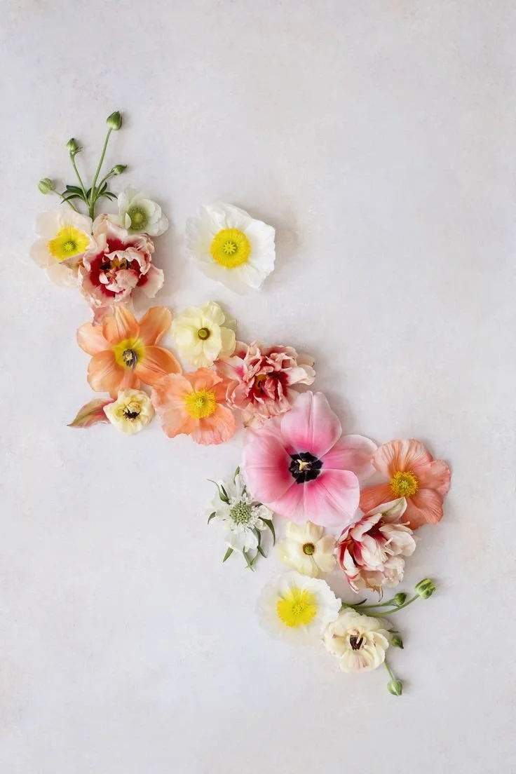
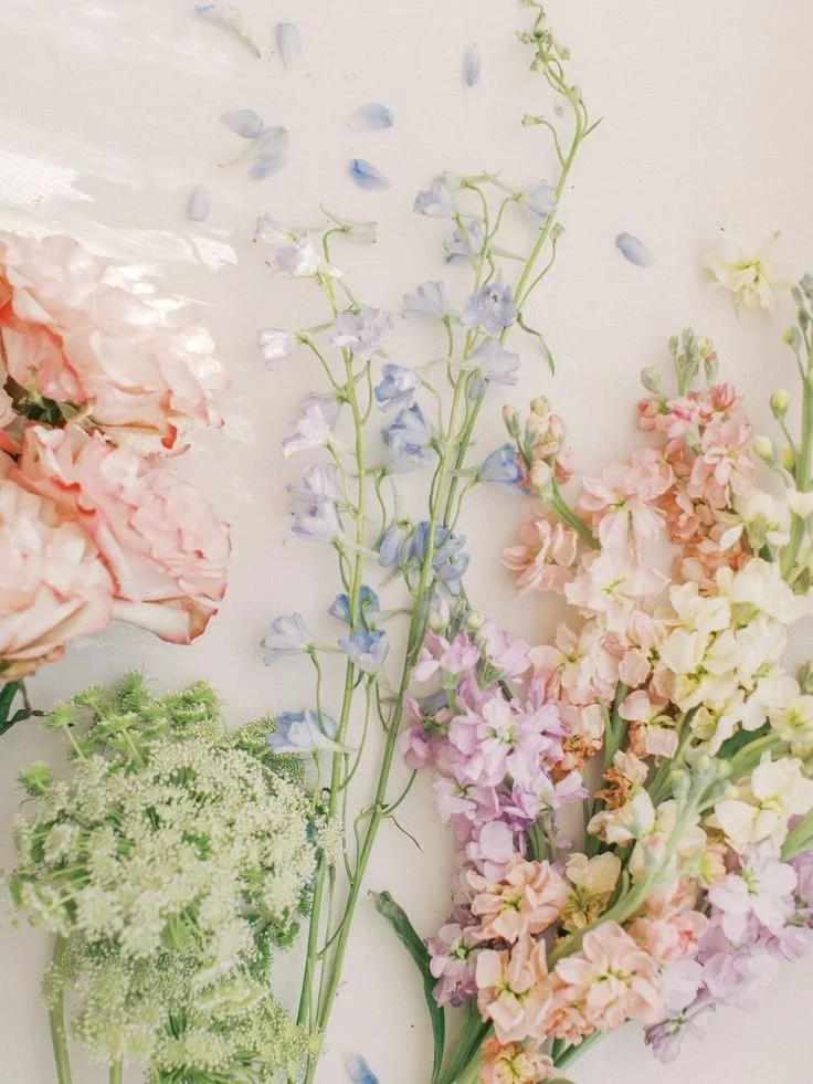
Romantic: blush, mauve, cream, soft greenery
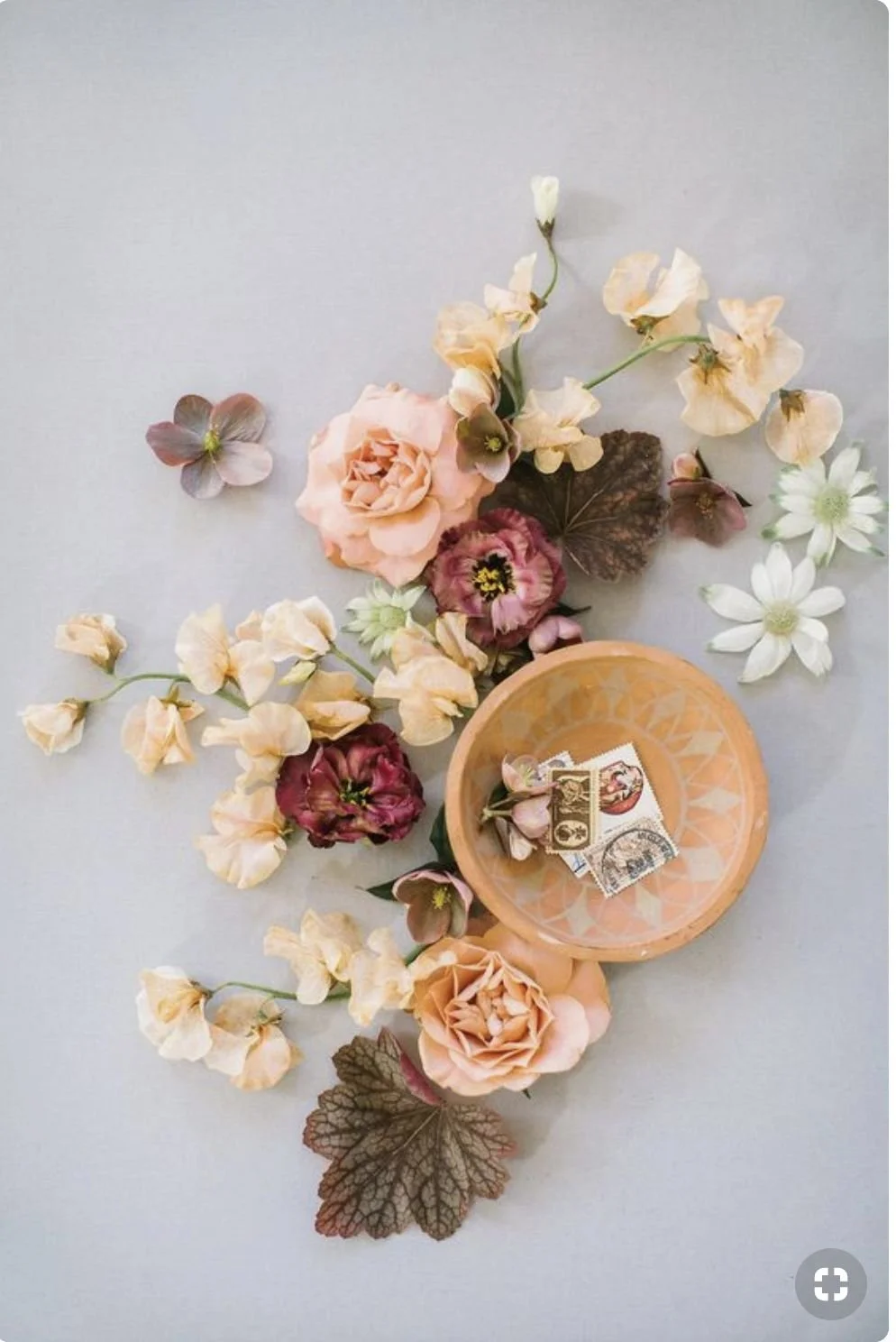
Bold: terracotta, coral, wine, amber
Modern: crisp white, black, sage, muted gold
When your colours match the feeling of your day, everything else — from flowers to decor — falls into place beautifully.
2. Let the Seasons Inspire You
Each season has its own natural rhythm and palette, both in colour and in flower availability. Working with your season ensures your flowers are at their freshest and most beautiful.
Spring Weddings
Soft pastels, fresh greens, and airy romance.
Think blush, lilac, butter yellow, and ivory.
Summer Weddings
Warm, sun-drenched tones and lush texture.
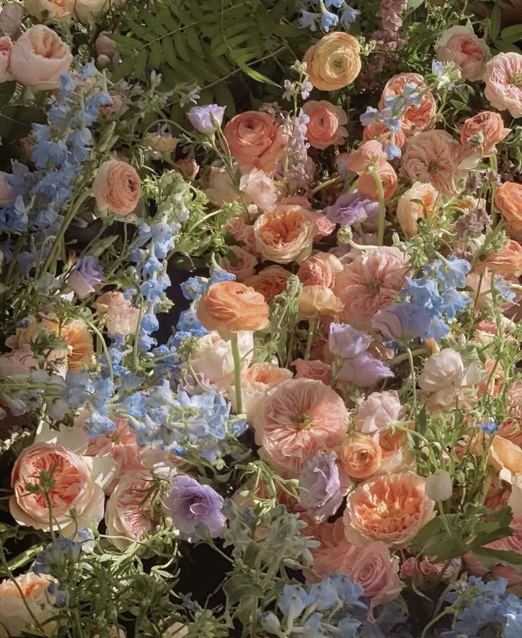
Terracotta, coral, gold, and cream.
Autumn Weddings
Earthy, moody, and romantic.
Rust, toffee, burgundy, caramel, and olive.
Winter Weddings
Elegant neutrals and deep, rich contrasts.
Ivory, champagne, sage, berry, and navy.
3. Keep Your Palette Balanced
A simple but timeless design principle: the 60–30–10 rule.
60% main colour (the anchor tone)
30% secondary tones (to add harmony)
10% accent colour (for contrast and pop)
This small detail makes your overall wedding design look intentional, polished, and beautifully cohesive.
4. Think Beyond Colour — Focus on Texture & Tone
Colour isn’t everything — the finish and texture of your flowers matter too.
A bouquet of pastel blooms feels completely different when designed with fluffy petals and movement versus sleek, structured stems. Texture creates depth and adds that editorial, luxury touch Dynasty Events & Florals is known for.
5. Use These Free Tools to Explore Palettes
If you’re still experimenting with colours, try these free online tools:
🎨 Coolors.co — quickly generate palette ideas
🖌️ Adobe Color — explore colour harmonies
📌 Pinterest — start a “Wedding Colour Palette” or “Floral Vibes” board and pin what feels like you
Get the Free Seasonal Bloom & Colour Guide
If you’ve recently inquired with me, keep an eye on your inbox — your Seasonal Bloom & Colour Guide will arrive shortly!
Inside, you’ll find curated seasonal palettes, flower inspiration, and design tips to help you start dreaming in colour.
If you haven’t inquired yet, I’d love to connect and create something completely unique to your love story.
👉 Inquire about your wedding here
or
✨ Follow along for floral inspiration on Instagram @dynastyeventsandflorals.


